Michael Senkow
I Build Machines
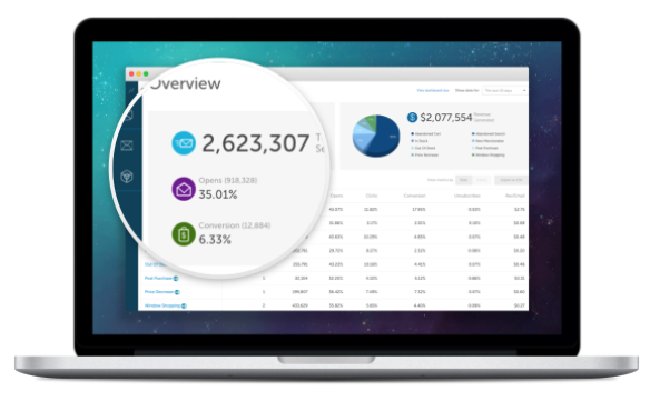
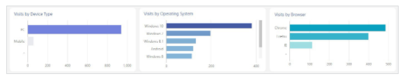
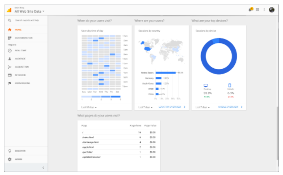
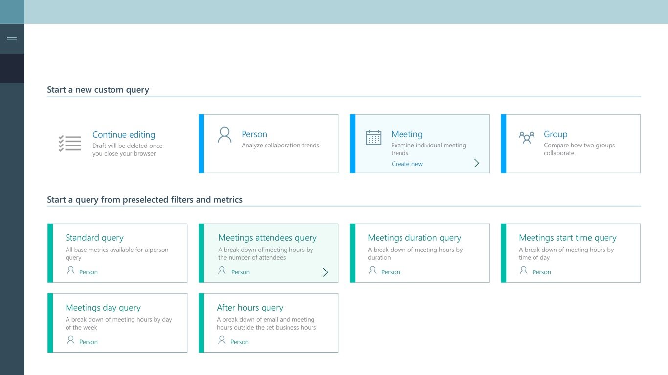
Original home screen of the product, when I started in 2017
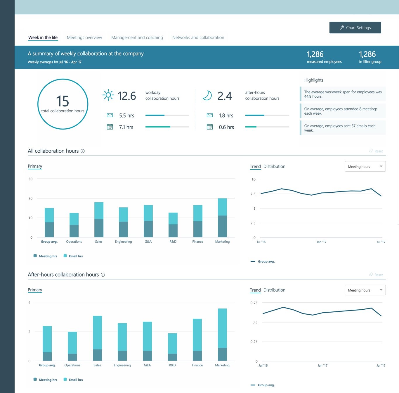
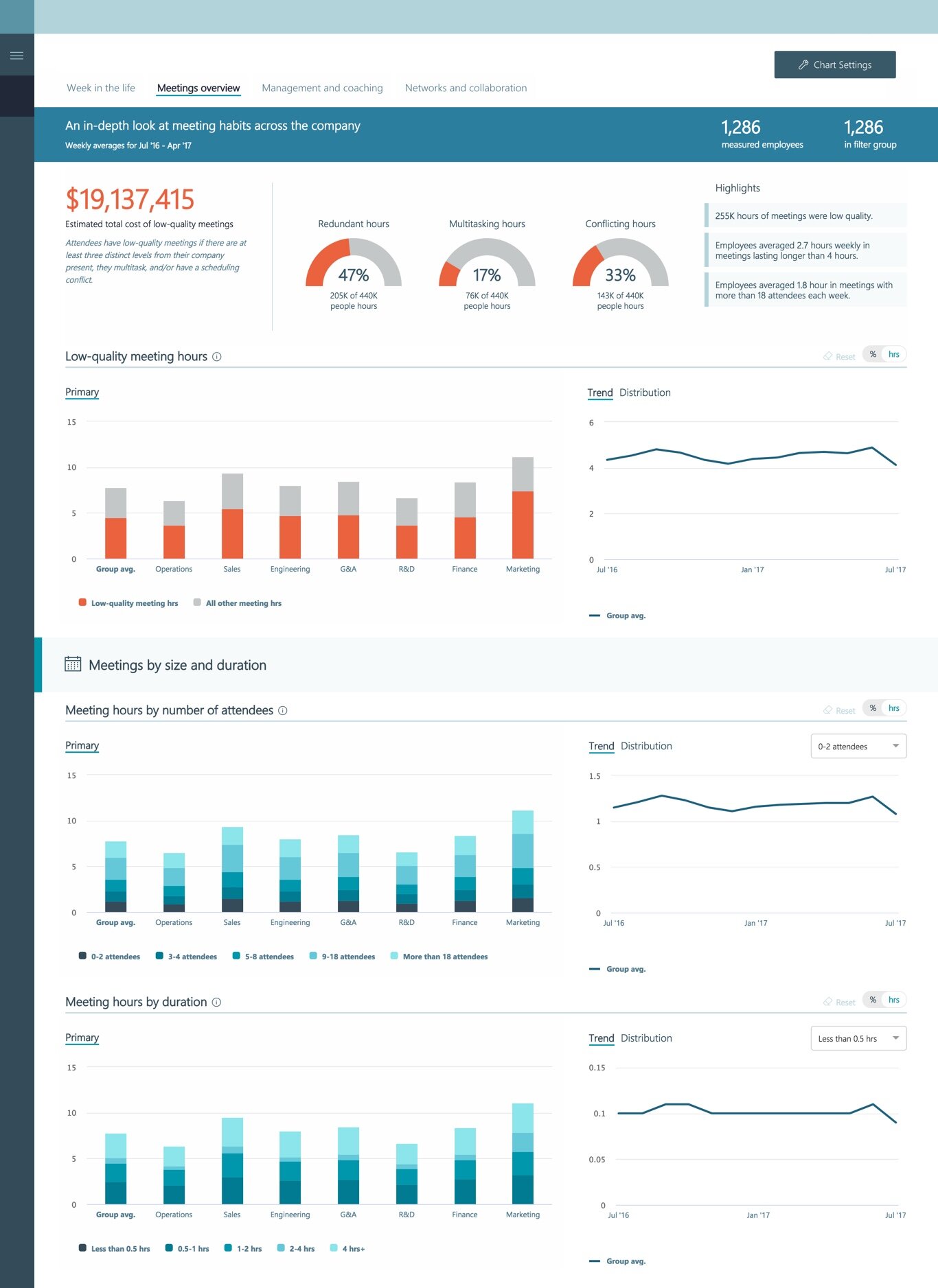
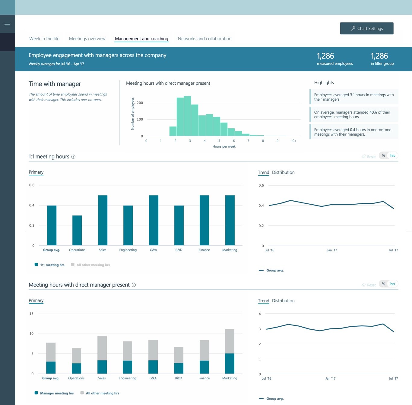
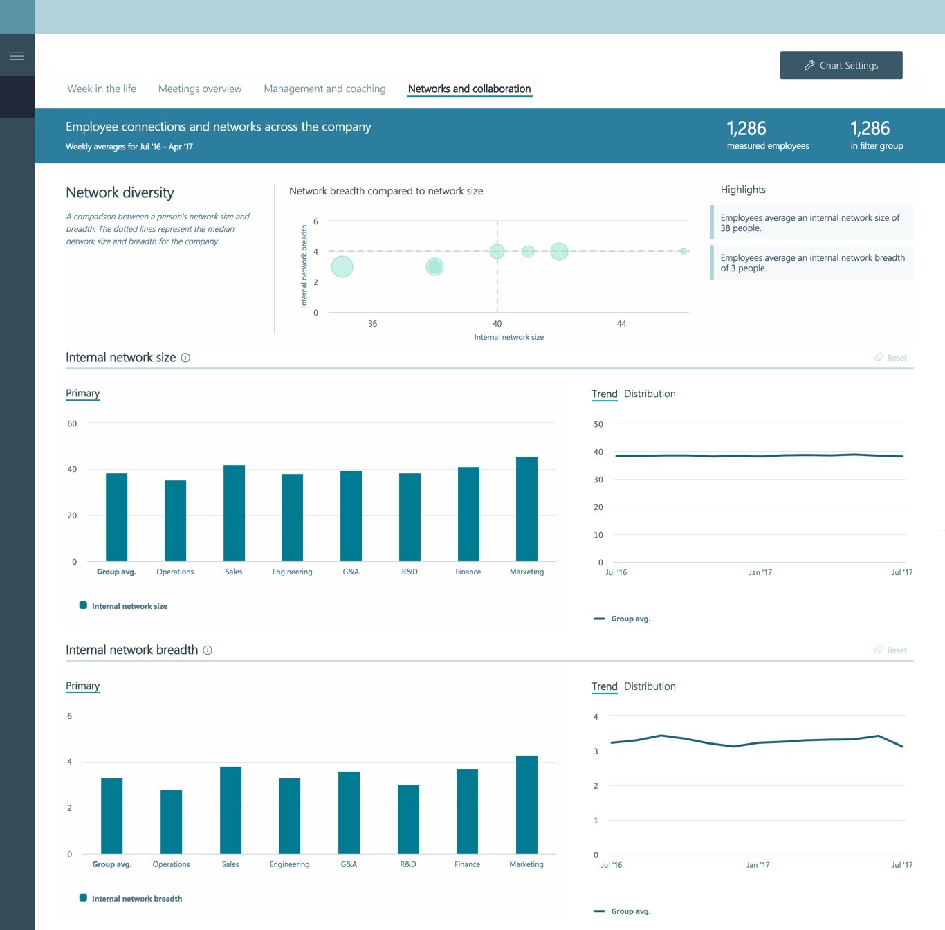
workplace analytics: programs, analytics, and nudges
Role: Product Designer, Researcher, Visual Designer, Data-Viz and Statistics Consultant, Front-End Programmer
Entity: Microsoft
Location: Redmond, WA (collaborating with remote teams in India, Wisconsin, and California)
Years: 2017–2019
Team make-up: Initially worked with a manager and one other FTE designer alongside multiple PMs and engineers. Later, became the sole FTE designer working with multiple contractors and remote designers. Eventually helped onboard and support a new manager and additional FTE designers.
The addition of Solutions
Alongside other smaller component and overall system redesigns, the biggest design push I saw on my stay with Workplace Analytics was the addition of Solutions.
The tool when I started was moire of a pure analytics tool. HR directors and business admins could input data-sets of their organize and gain general insights. Much of the work was still on the data-scientist side though. THEY still had to peruse through the data, find important key points, and determine answers.
The goal of Solutions was to augment the existing product, and then connect it to the rest of the Office Suite, with the goal of automating the process of determining that a problem exists in an organization, selecting the group having that problem (while never specifically seeing individual people) and then deploying a set of system wide communications to improve the group having said problem.
Mood boards, sketches etc.
As part of the process, and at the time part of my process was simply getting acquainted with the product, Mood boards were created, ideation via sketching was done between myself, my design lead, and design contractors who were brought in when needed.
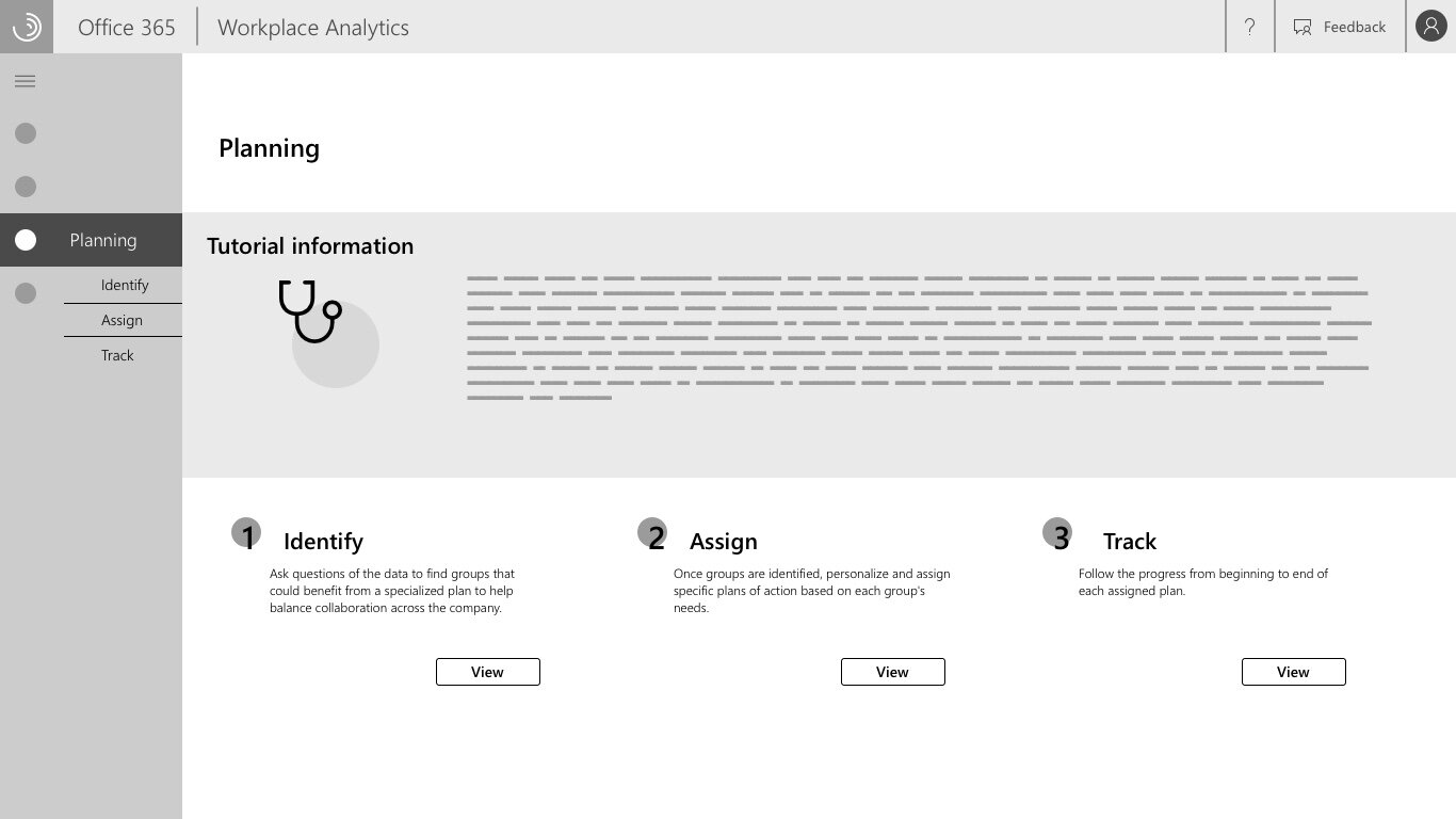
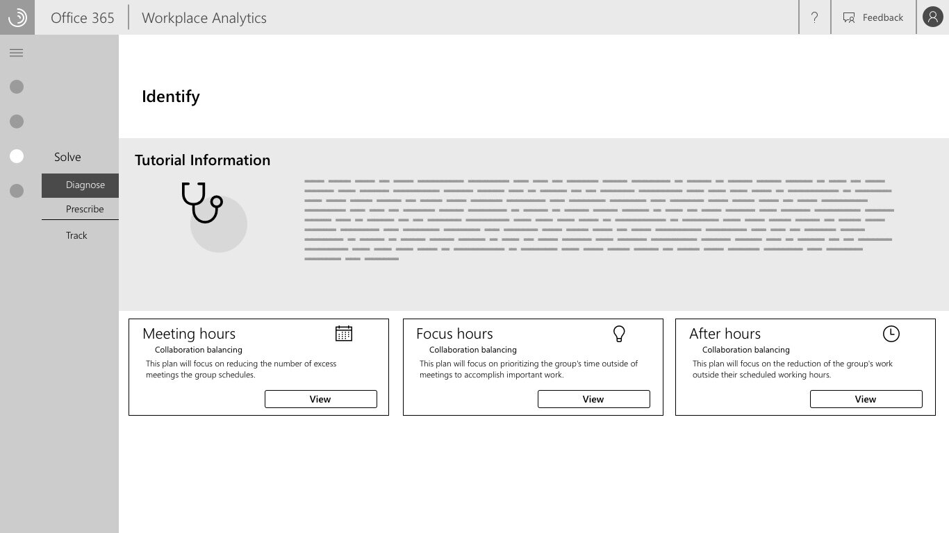
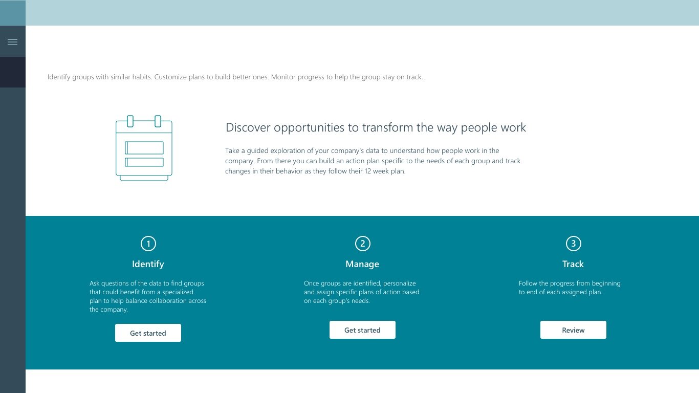
Initial set of wireframes
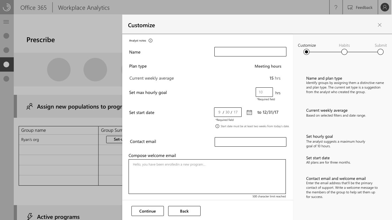
Wireframes were created, fleshing out the different steps of the process and also opening up more design discussions.
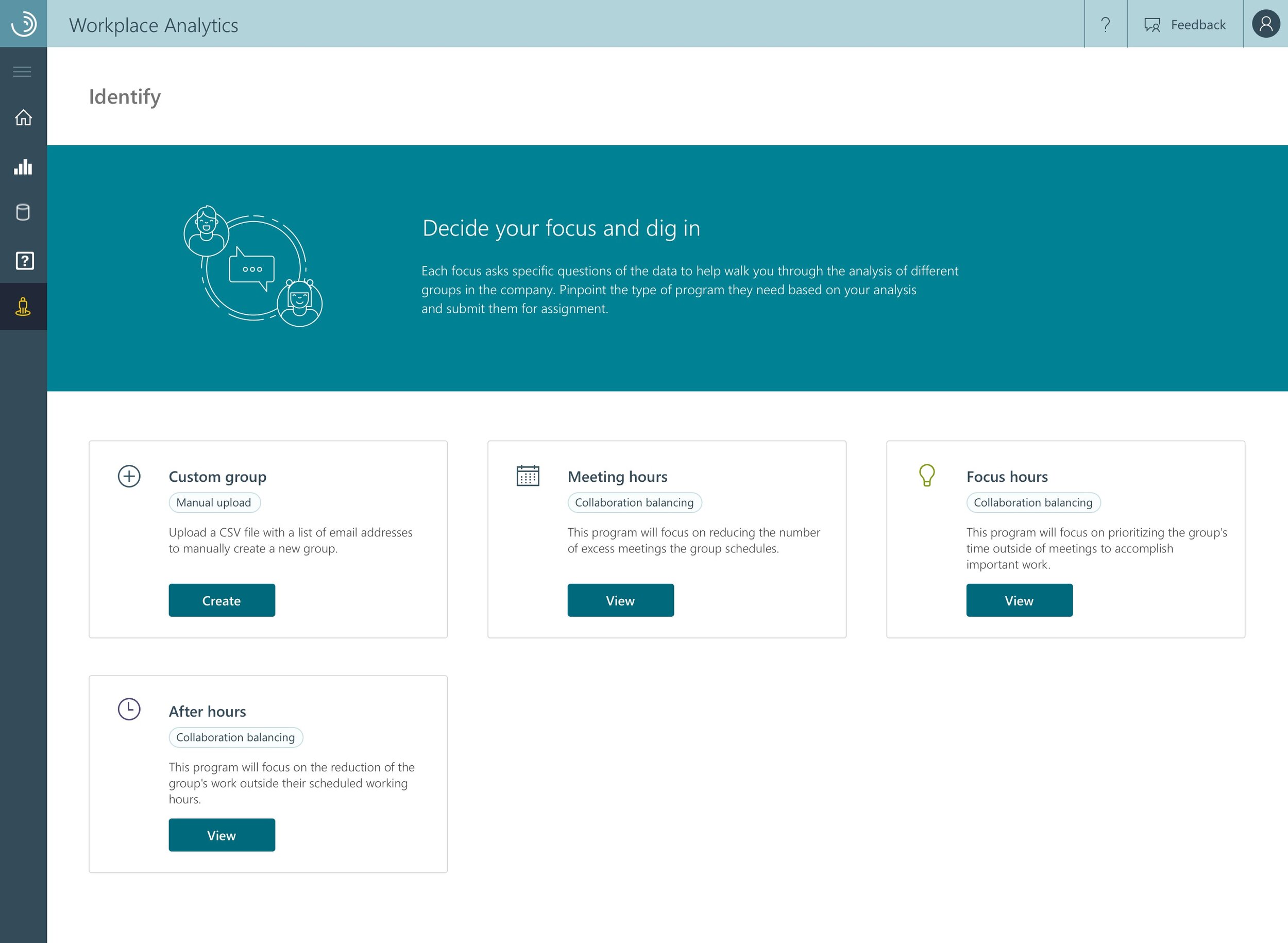
Solutions? Programs? Plans?
What steps would the users move through to select the groups they were dealing with.
How much of the tracking information needed to be shown. How technical did it have to be?

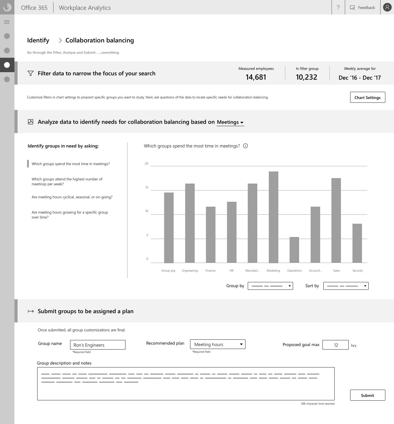

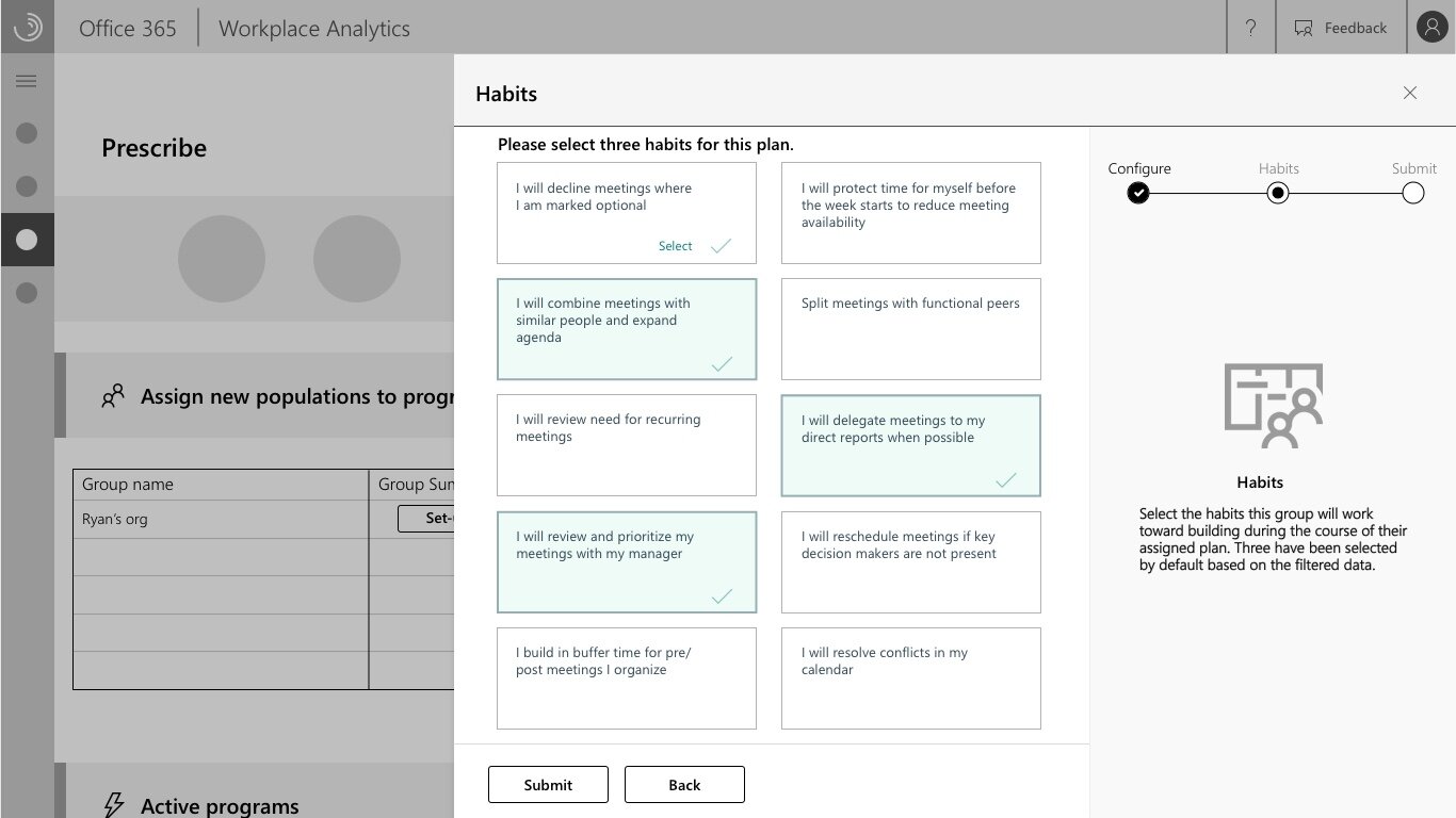
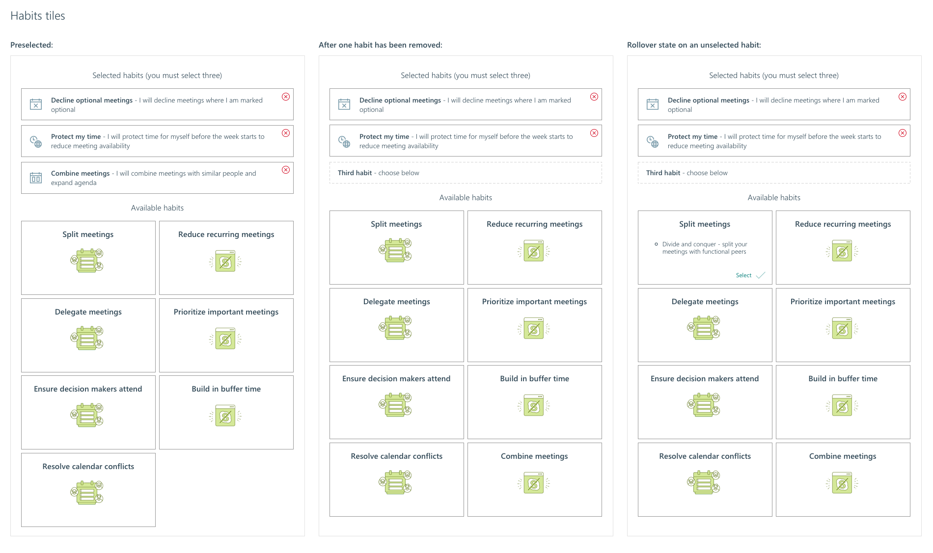
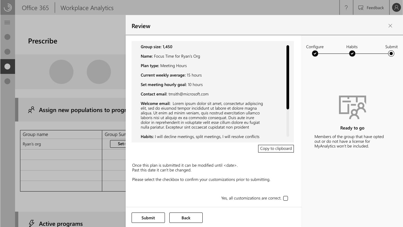
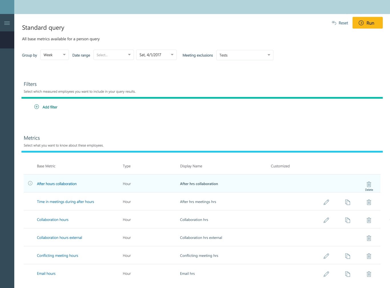
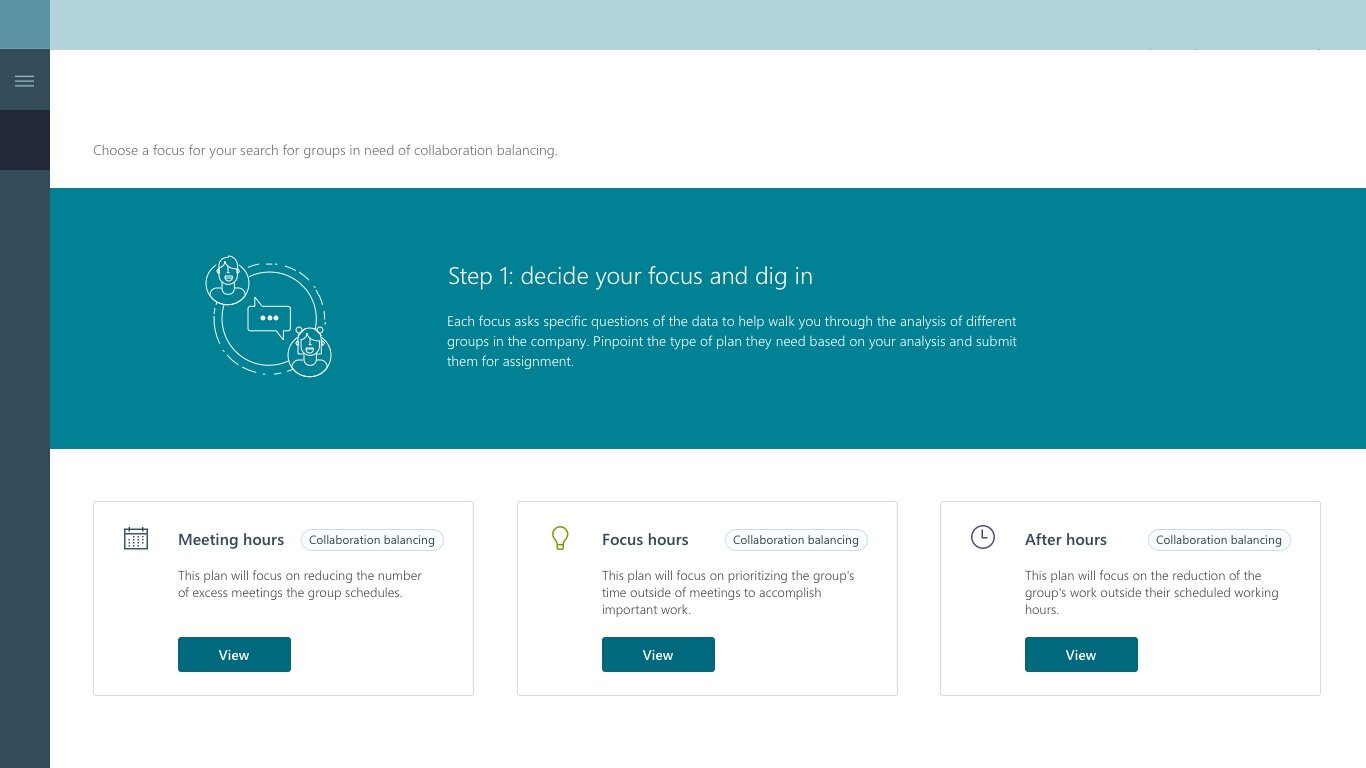
Final high fidelity designs
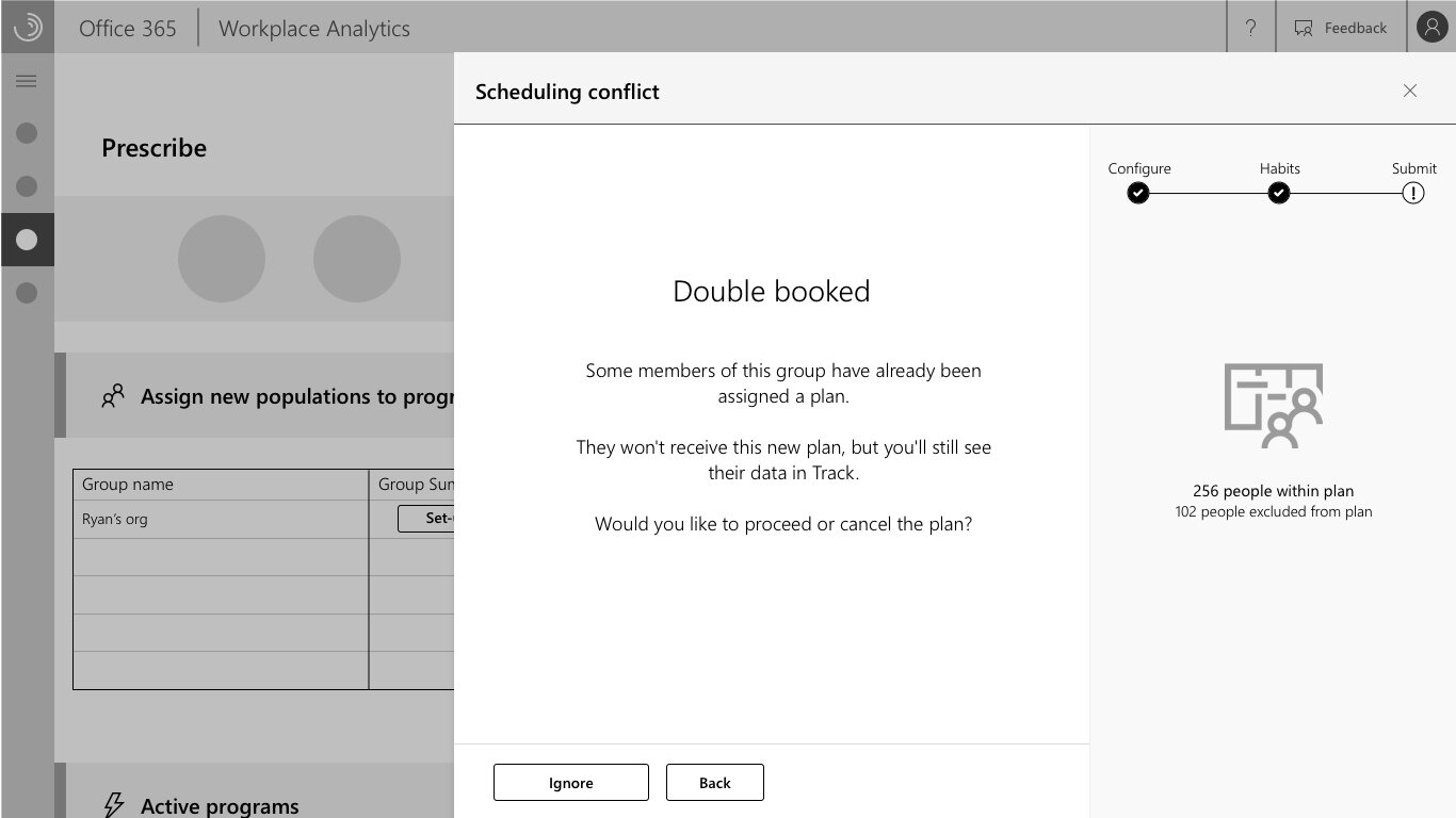
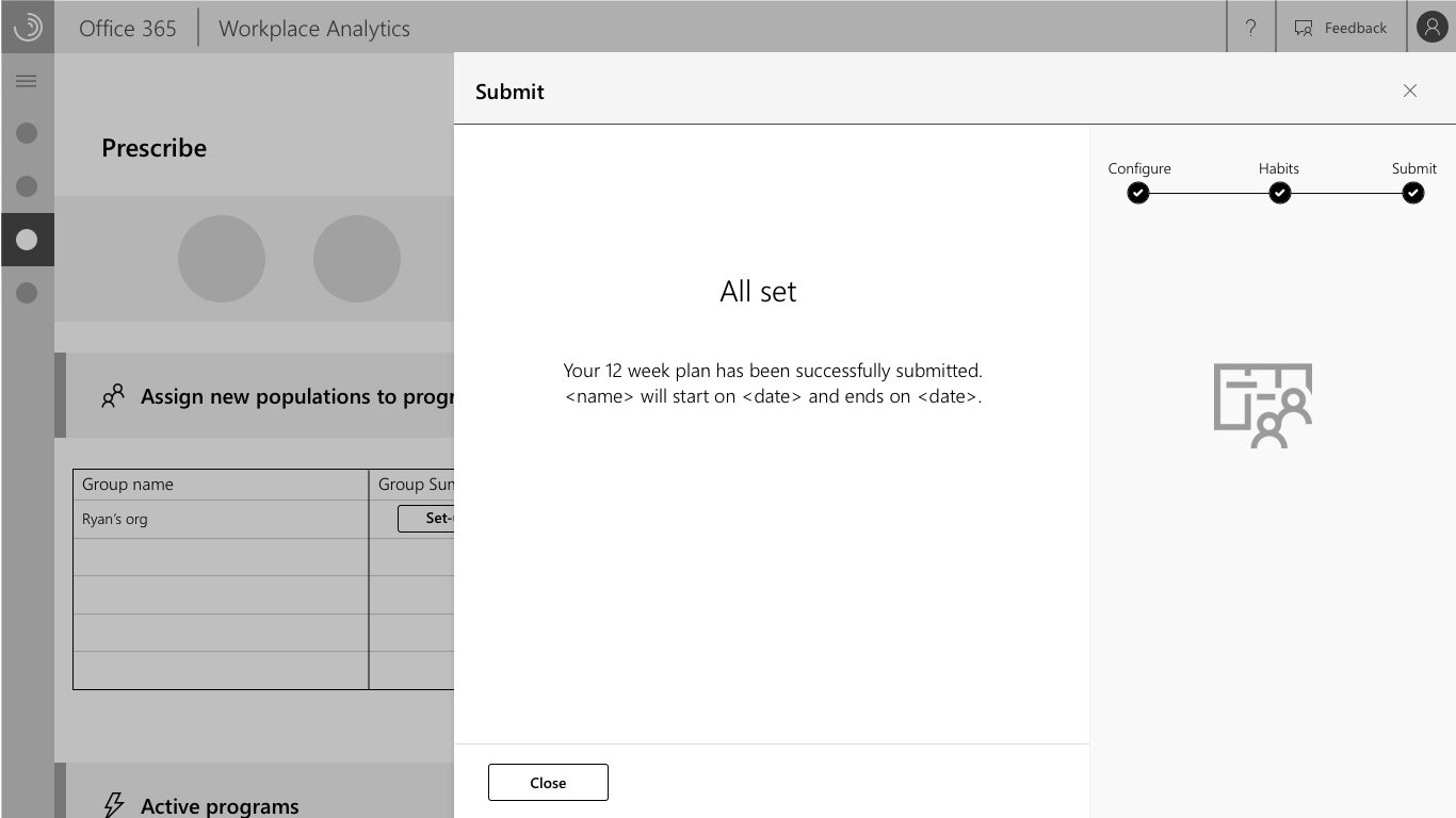
A final set of designs was created, and tested again with internal and external stakeholders. This resulted in a few specific larger changes to the design and layout.
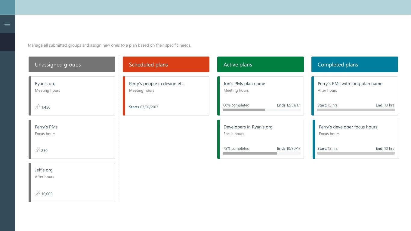

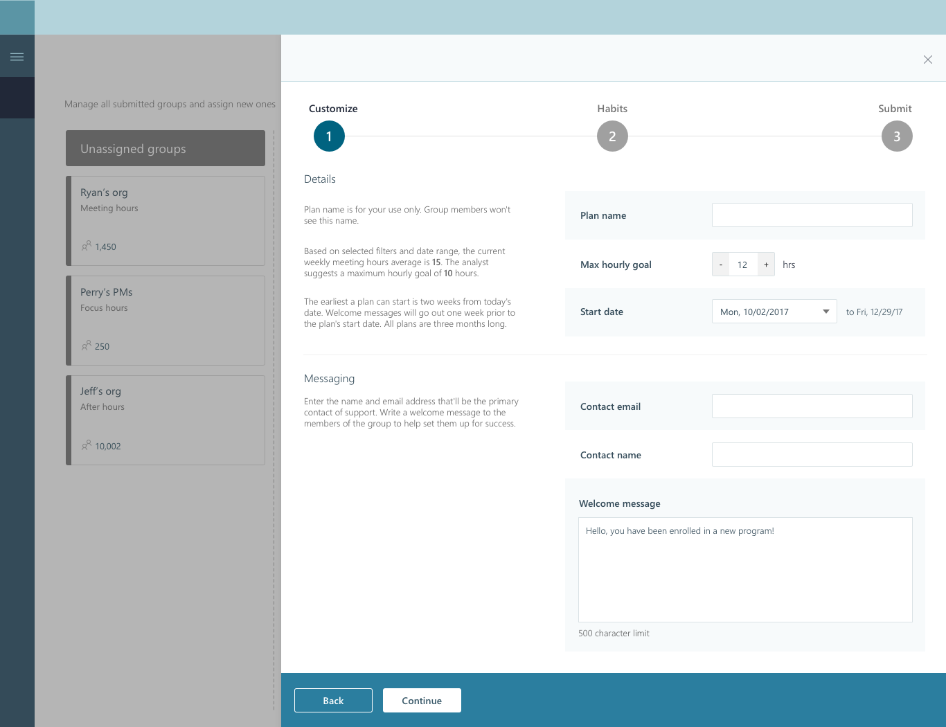
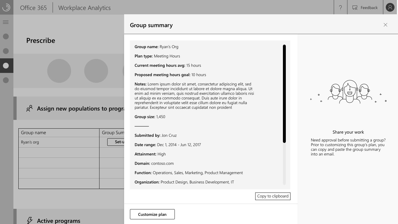
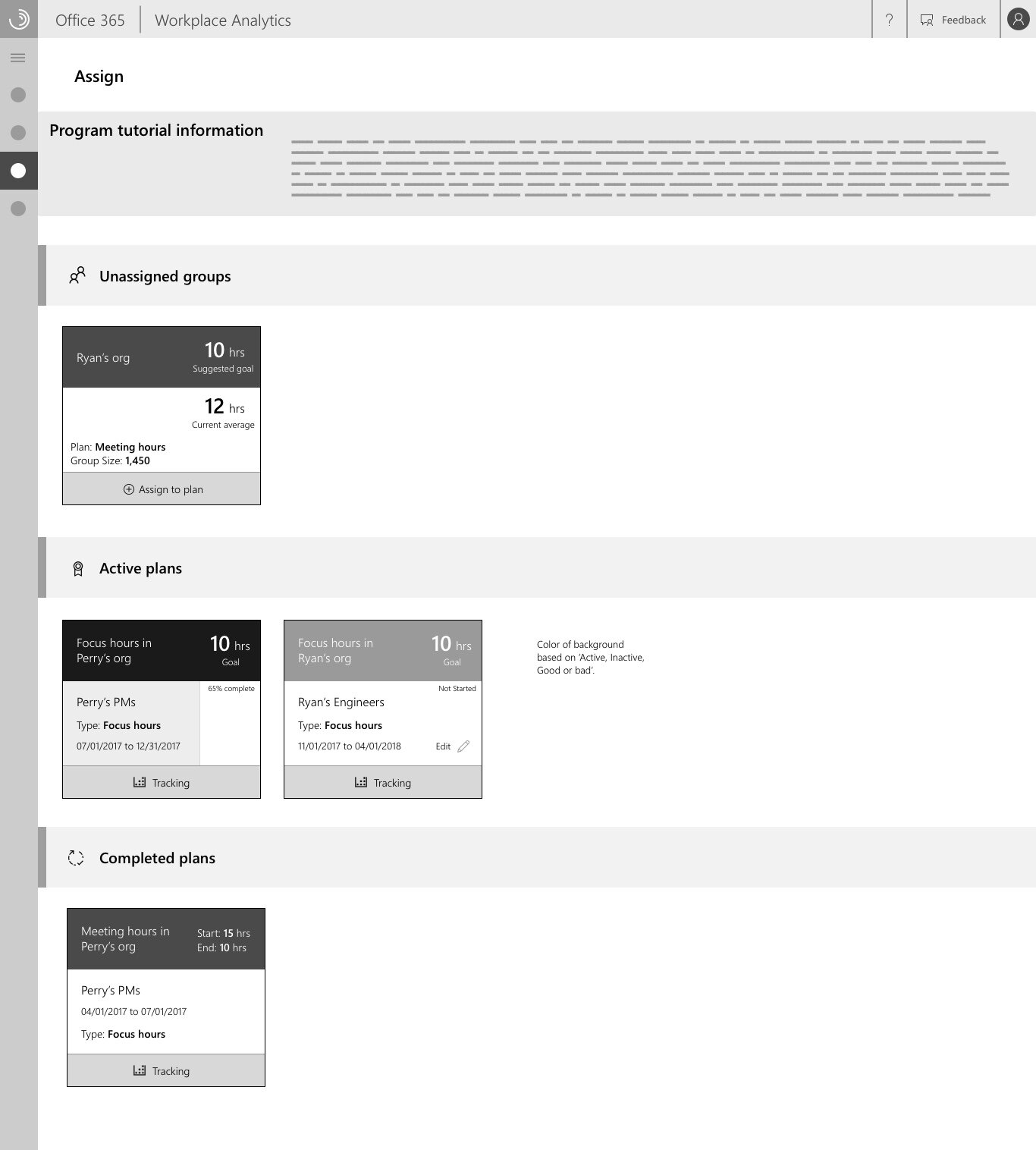
The management of submitted groups for example changed from a list concept into more of a kanban-based, trello-esque setup, with the goal of letting managers of the application keep track of where groups were in the process more easily.


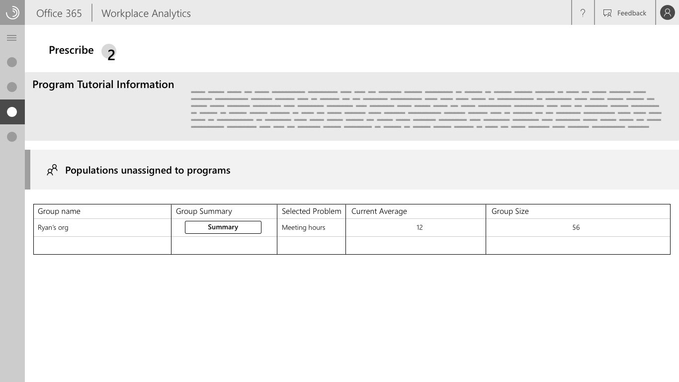
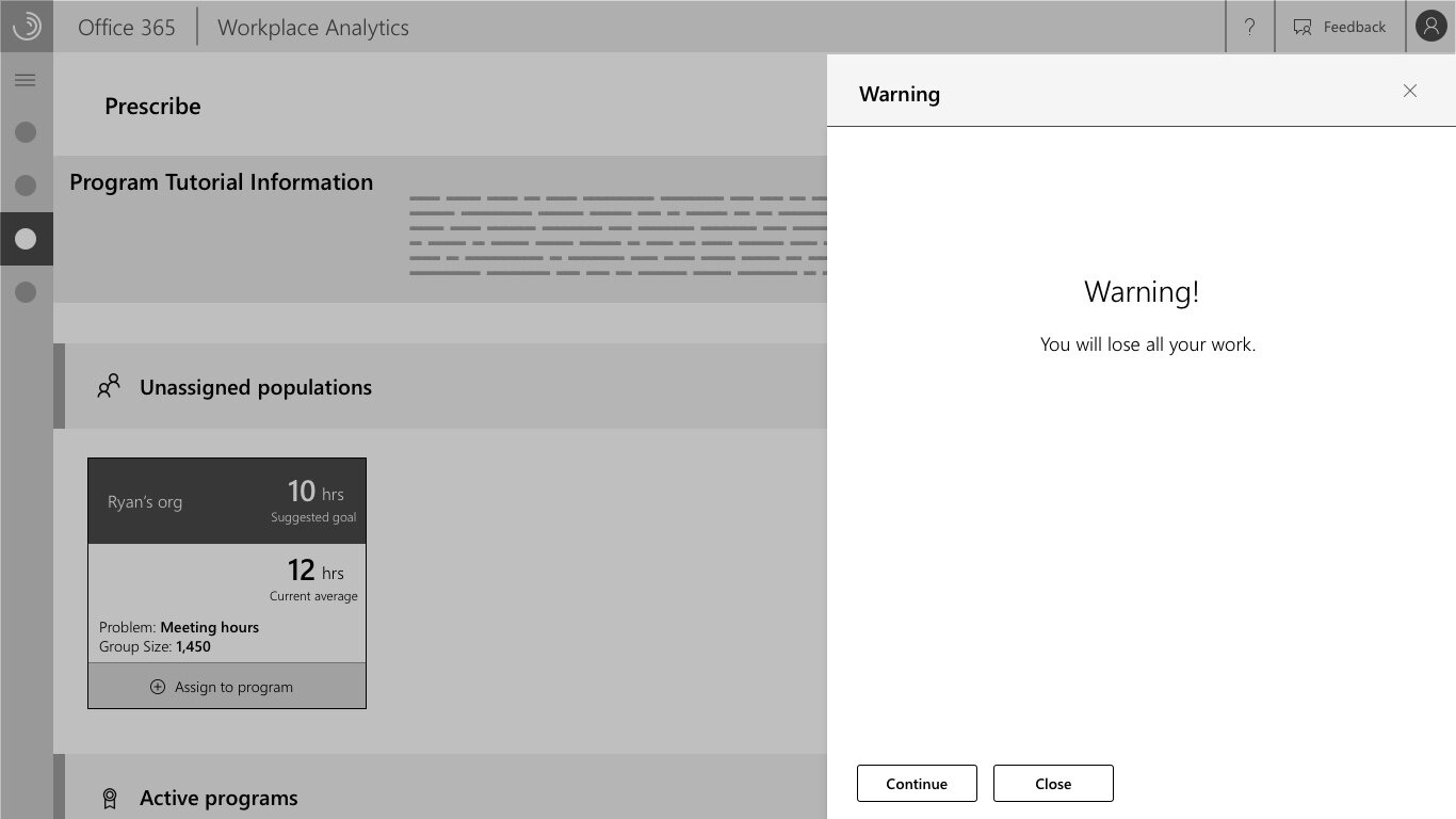
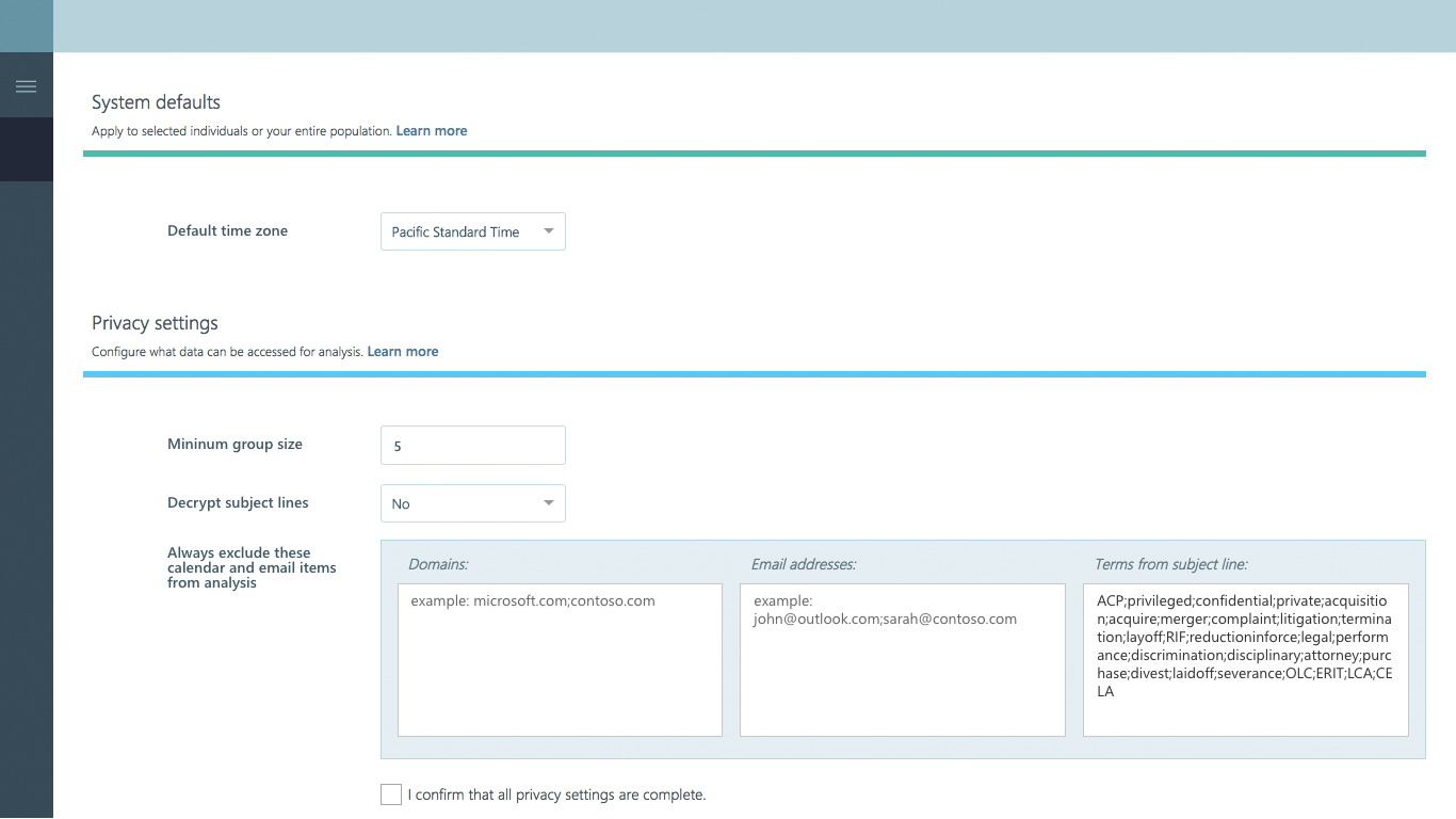
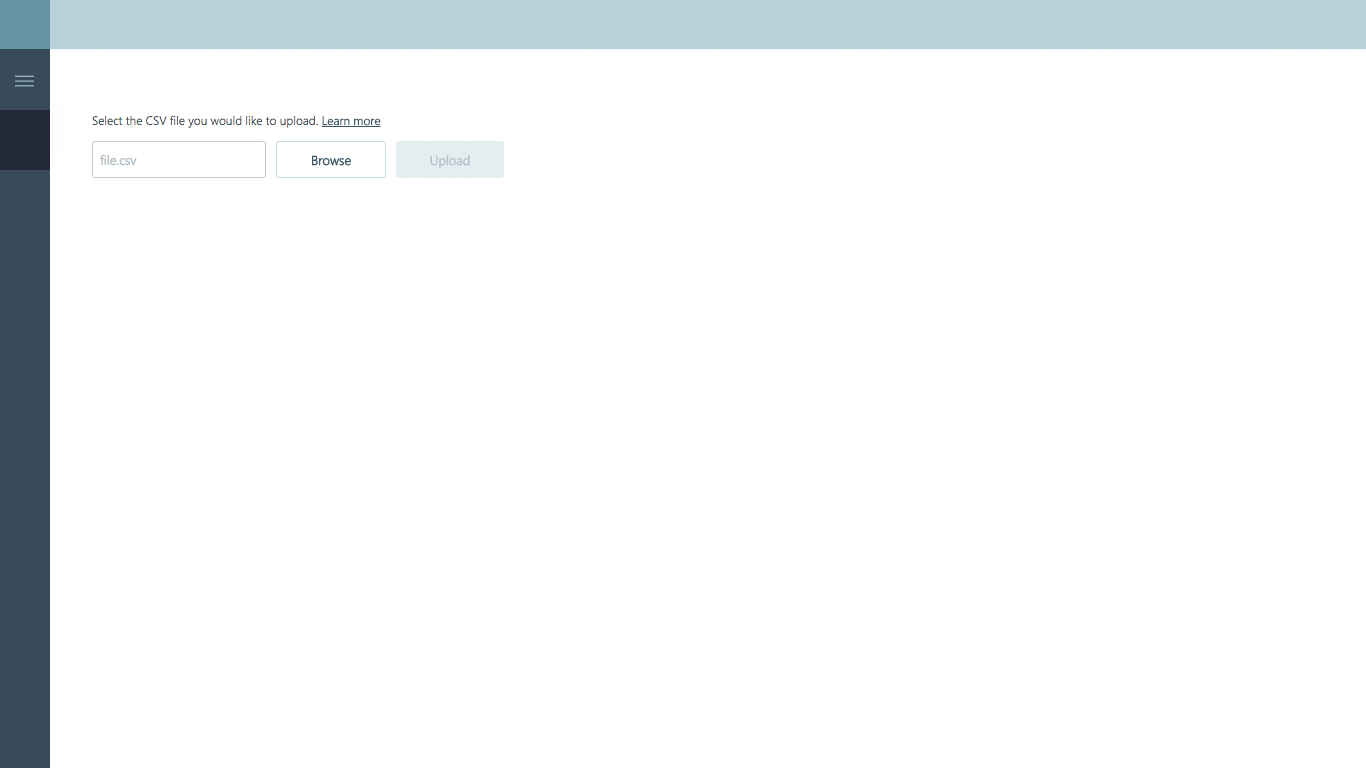
And while a ton of work was put into Identify, the step in the process where users would be able to dig through their org, identifying which groups had issues, and then putting them into a Solution….people still simply wanted to upload CSV files, as there were often known groups of people at a company that were having time issues and would benefit from the solution concept. So I worked through a set of manual upload screens, providing multiple places in the product where this step would appear.
Which eventually was altered a bit more to change from its location within the sub-title of the manage page, to being part of the upper tool-bar (a pattern that started to be mimicked across the product, and changed the locations of other interactions, such as the settings and other page wide setting concepts.
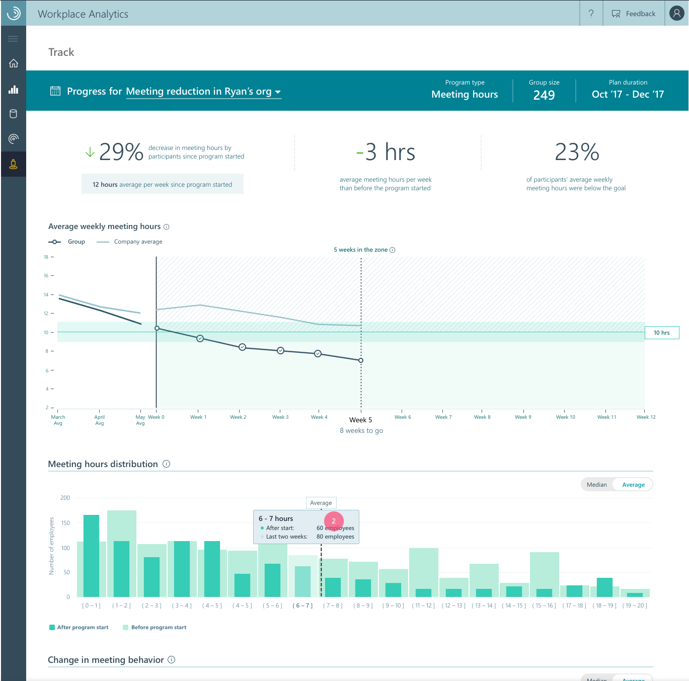


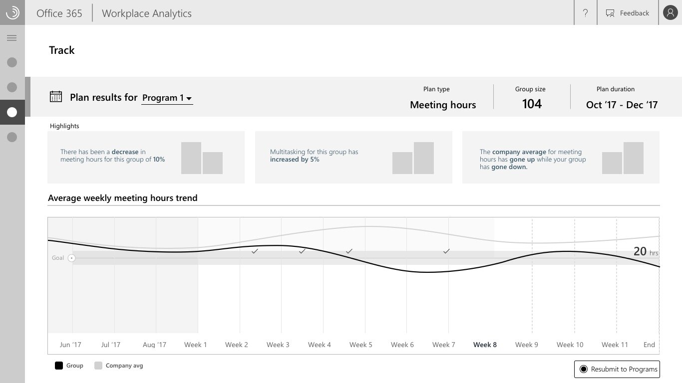
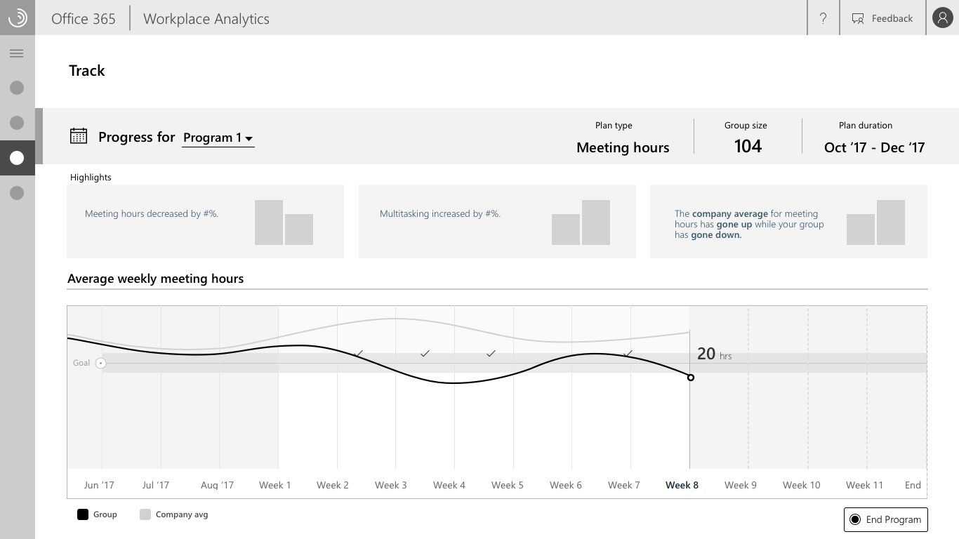
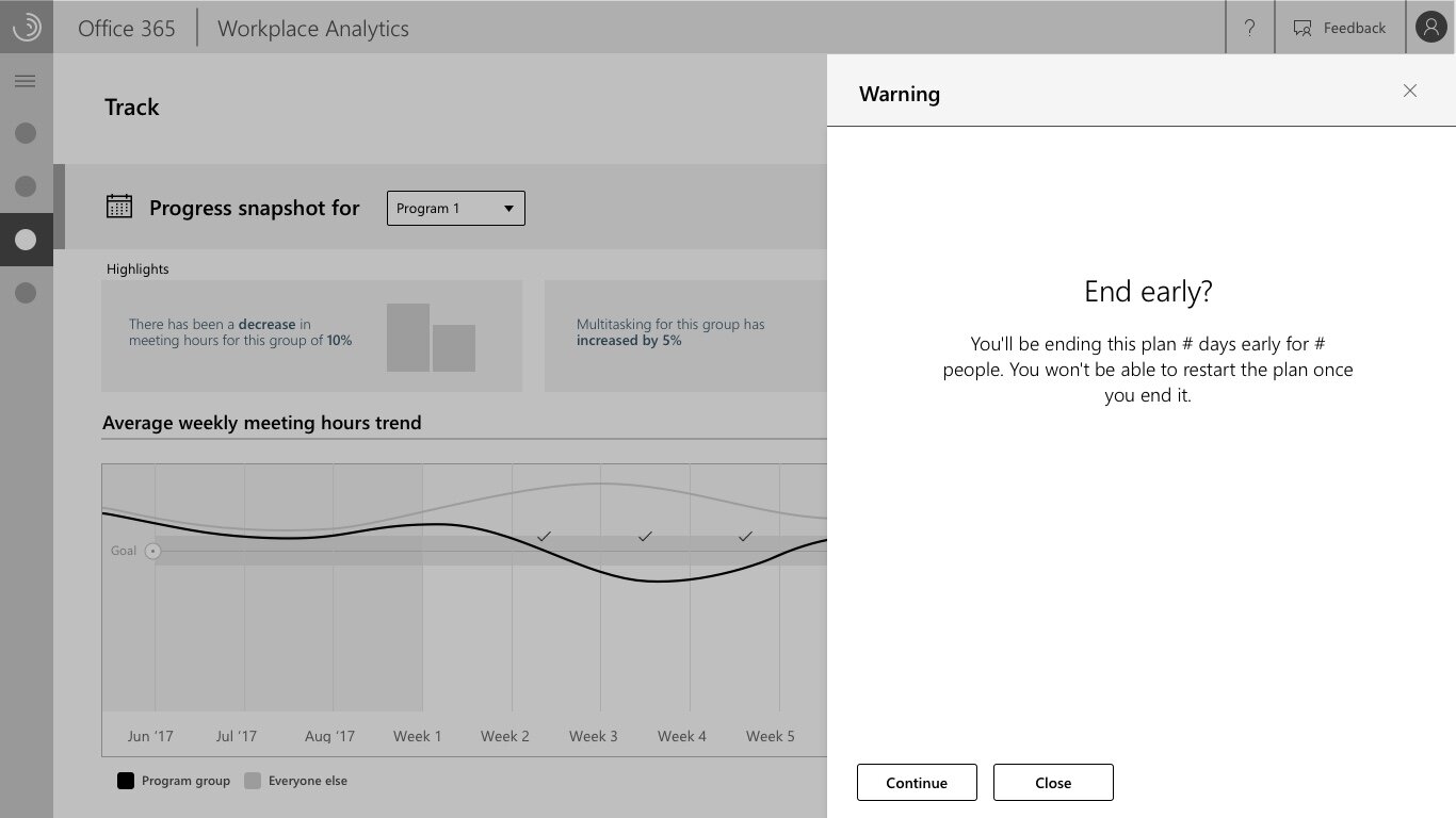
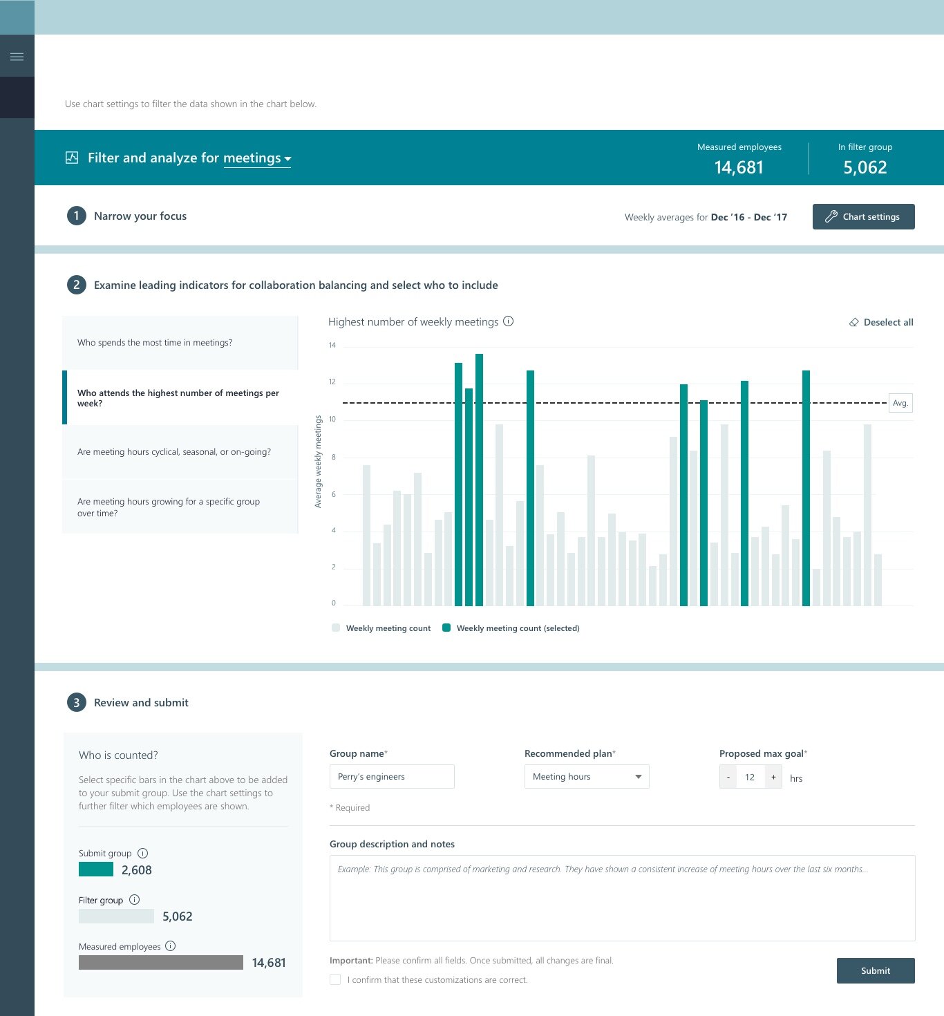
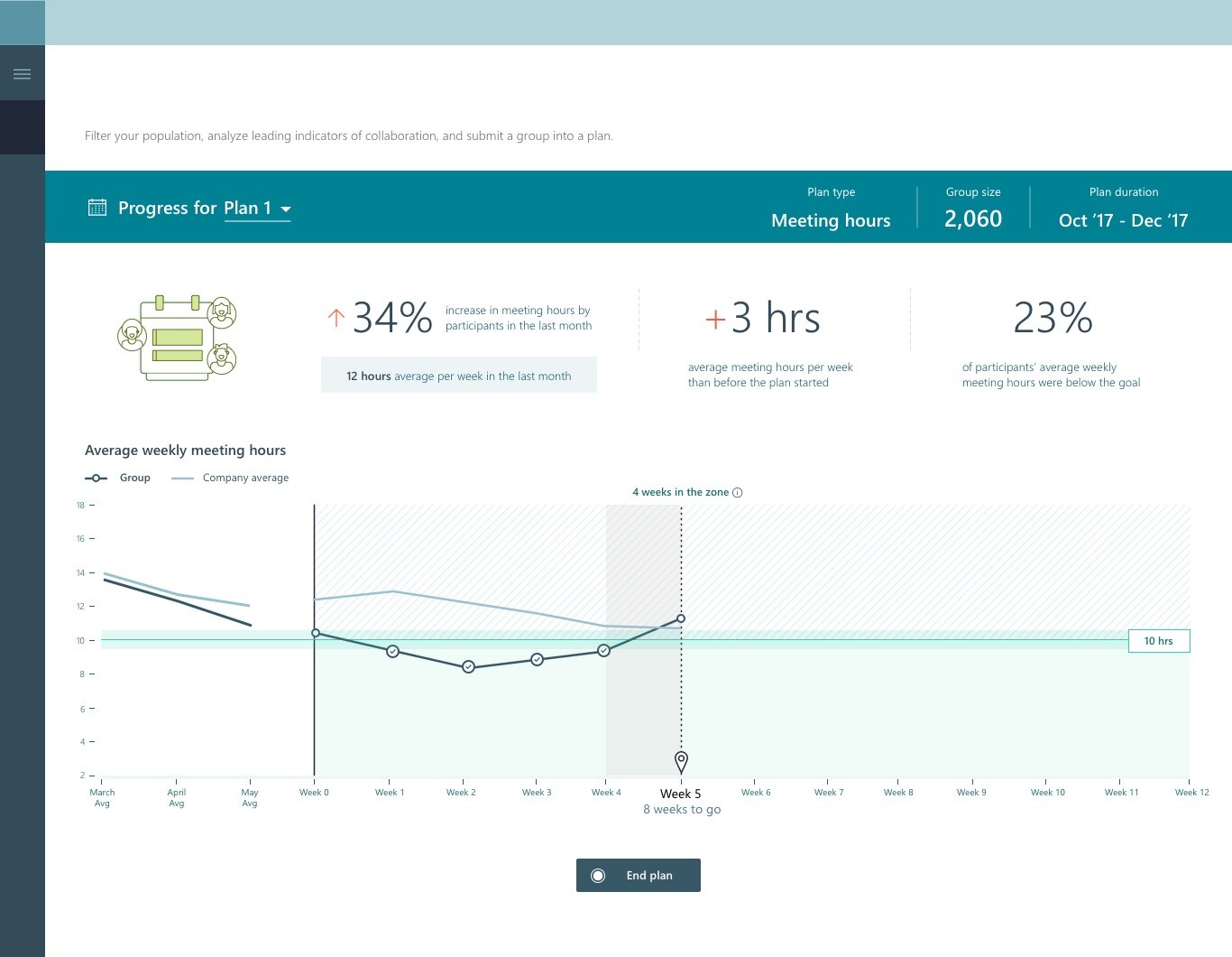
And additional steps were taken to explore and add to the tracking section.
And also finessing specific details. At Microsoft, the developers I’ve worked with are often working on different continents in different time zones, so small mistakes leak through. I’m big on trying to make sure the details match and then determining where specifics matter. Here for example, we eventually decided to maintain similar overall patterns, but average lines would remain dotted while goal lines would be solid, and color themed based on the topic matter.
Design is cyclical. Email templates, additions, and further development.
These initial sets of work turned into the later specifics around cards and topic keywords.