Michael Senkow
I Build Machines
SPSS Modeller
Feature 1
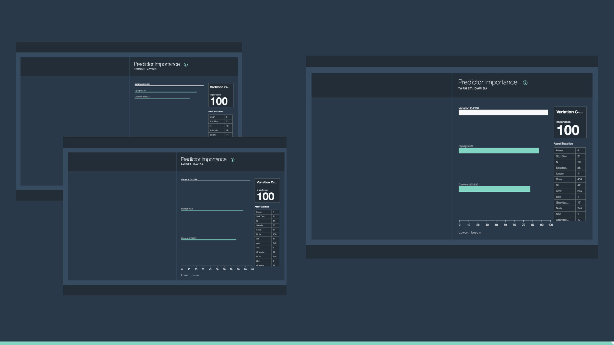
The connected screens show a variety of iterations we went through, going from extremely direct versions, to experimental concepts, and then the final products.
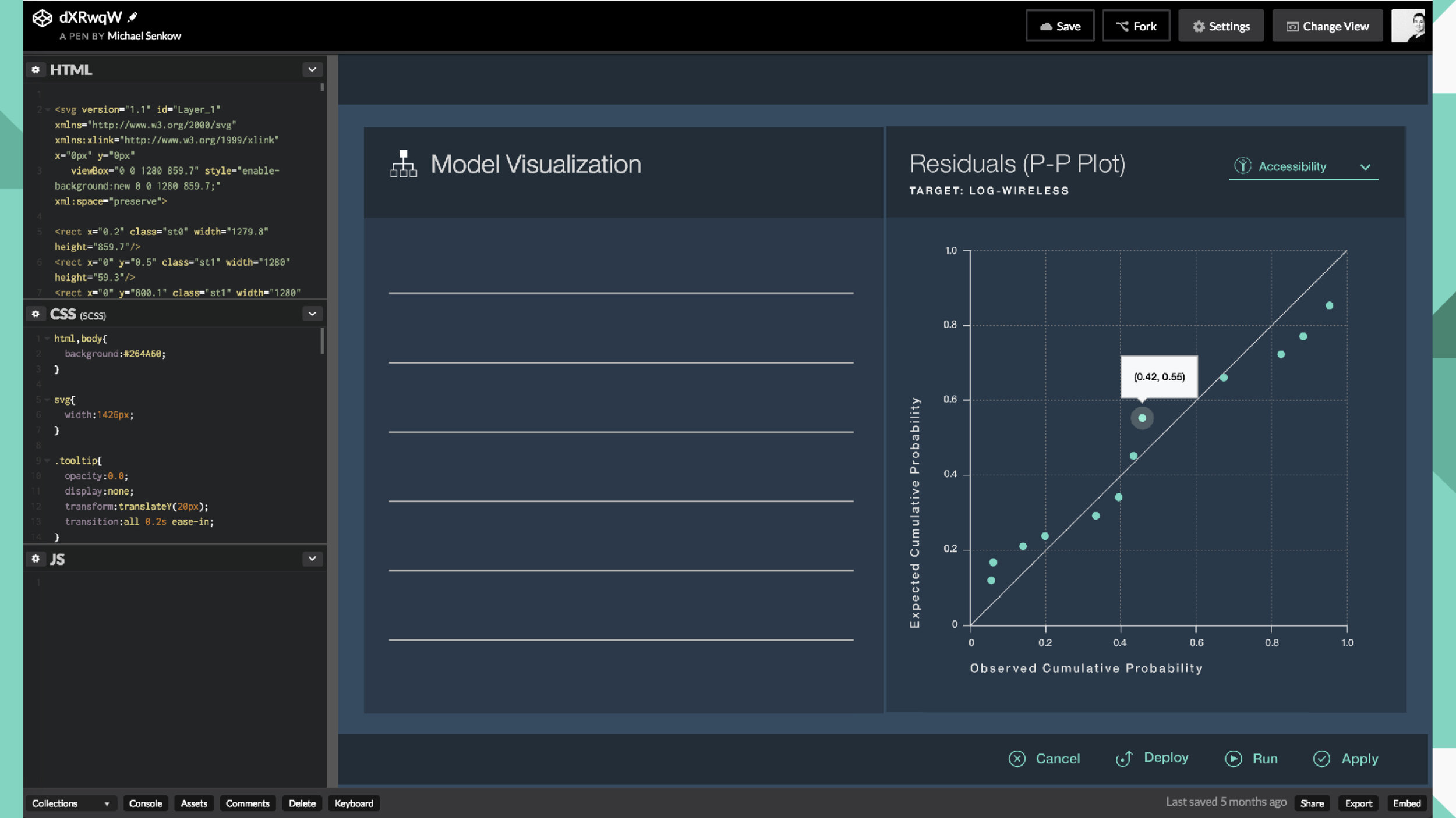
This was another place in which my coding skills were useful to really think through interactions for development. The real focus was keeping track of multiple visualization types at the same time and making sure they felt like they came from the same family, followed the larger Watson Analytics Design Guide, and also didn't tax our engineers too much in their implementation.
The product finished completion enough that my final steps were really thinking through specifics. How do you show the bar charts at both the upper and lower limits of likely numbers, when there's only a few or a huge number of objects? How does this work responsively?