Michael Senkow
I Build Machines
re-envisioning my primary product;
my steps for laying out the beginning of a design system, refining it, and convincing stakeholders of its importance.
Role: Primary Designer for Interactions
Entity: Microsoft
Location: Redmond, WA (MyAnalytics – Workplace Analytics team)
Years: 2018
Team make-up: Initially worked with a design lead and another FTE designer. Later became the sole FTE designer in the US, leading 4 contractors and remote FTE designers in India. Eventually helped onboard and support a new manager and additional FTE designers.


Joining Microsoft, I started in the MyAnalytics and Workplace Analytics group, a subsidiary product team of the Office group.
Having come from a start-up that had been bought by the company its existing system was close but not quite fully cohesive with the rest of Microsoft.
At my time of joining the Fluent system had become a larger push at the company and I’d just come from IBM and my time on the Analytics Platform group where I had seen the importance of having some sort of cohesive design system.
On day one in MyA and WpA I only had prior designs, an incomplete color palette and some rules on typography that were in flux. Working around what existed often was a headache and caused lots of communication problems with eng and pm.
Incremental changes from the old system to the new


My first steps in the group were to first improve overall organization and start the steps to creating a documented design system.
Initially the goal was purely documentation and refinement of existing components. When I joined the team this really didn’t exist, so simply having a library to look to, to see when and where we weren’t being consistent was needed.
Issues arose because the initial color and font-systems were not complete.
Their implementation in the product were inconsistent and resulted in a wide spectrum in how patterns were used. My manager at the time was overwhelmed with pushes from Project Management for the addition of product add-ons rather than improvement of the existing product design. Fluent was being pushed across Microsoft, but the steps for this had passed by my team and without steps the product would continue to fall behind.
This was work that I was able to continue to expand upon alongside my other primary product work, partly because it improved my own process and speed and partly because I had seen how beneficial these steps can be for a design group from prior teams.
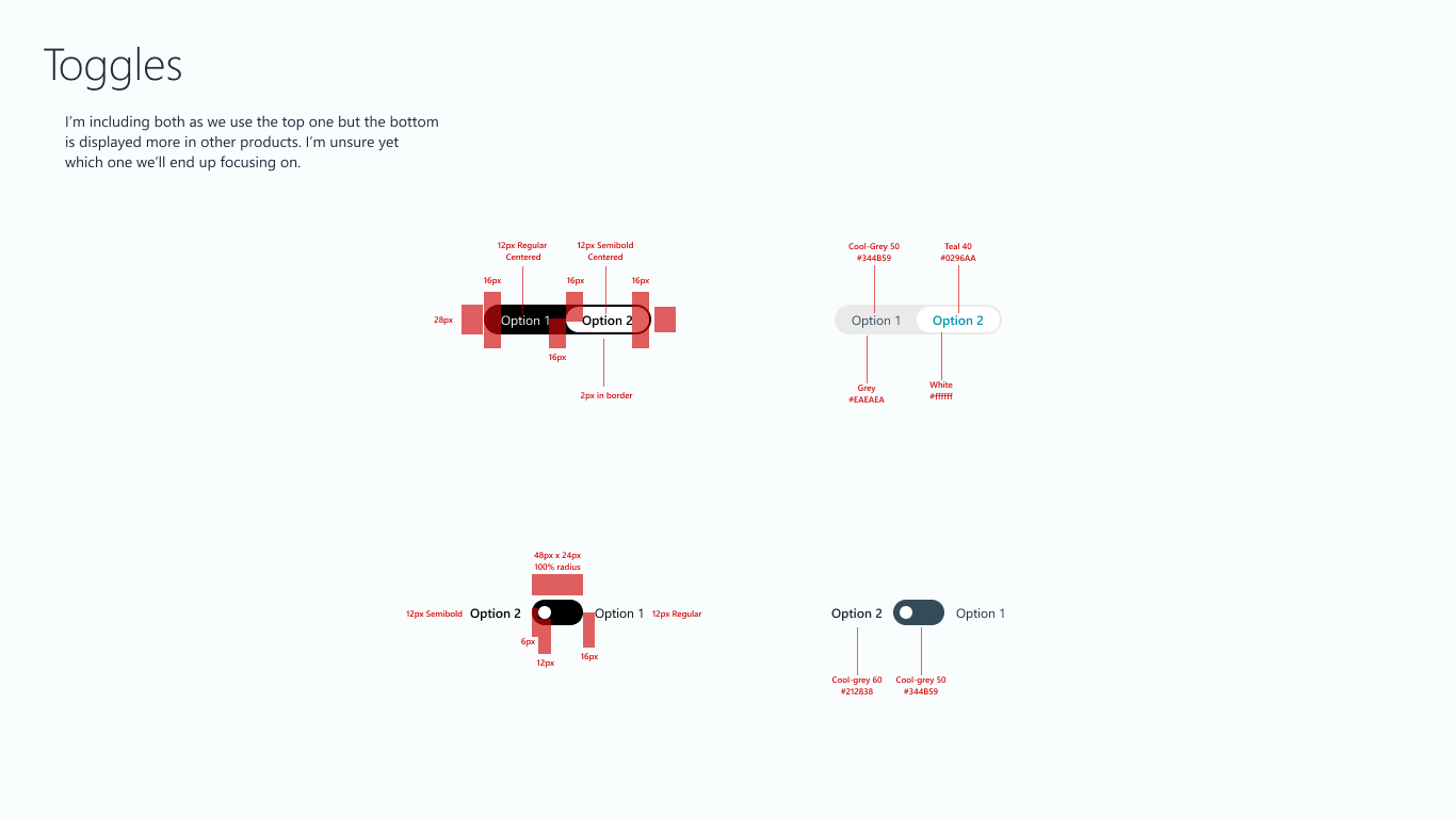
The existing MyA/WpA color palette was compared to palettes from groups working within the new Fluent architecture
Then refined down palettes that matched the existing branding


Concepts were made, and displayed to stakeholders (PM, Engineering and Users)
The rules behind the new system were not complex, just simple, minimal and systematic across all the components in the product. I continued to build upon this and refine it, alongside IC work, during a time that my manager and the other FTE in the group left for other products, and I had a period of being in charge of 4 contractors and working alongside multiple remote FTE designers from Microsoft’s India based design studios. This work helped build cohesion across our process.
Generally the system had a set of core concepts.
Pick a singular brand color, create a spectrum and apply that to the primary interactive components.
Select a base neutral spectrum and use that for all the other elements. Text, shadows, backgrounds, lines. etc. anything the user actually interacts with.
As data is such a large piece of this product, make it prominent and noticeable.


Around this time I was joined in Redmond by
a new manager and US based FTE Designers.
A deeper dive was taken during this phase to really look into all the components and patterns we were using in the product.
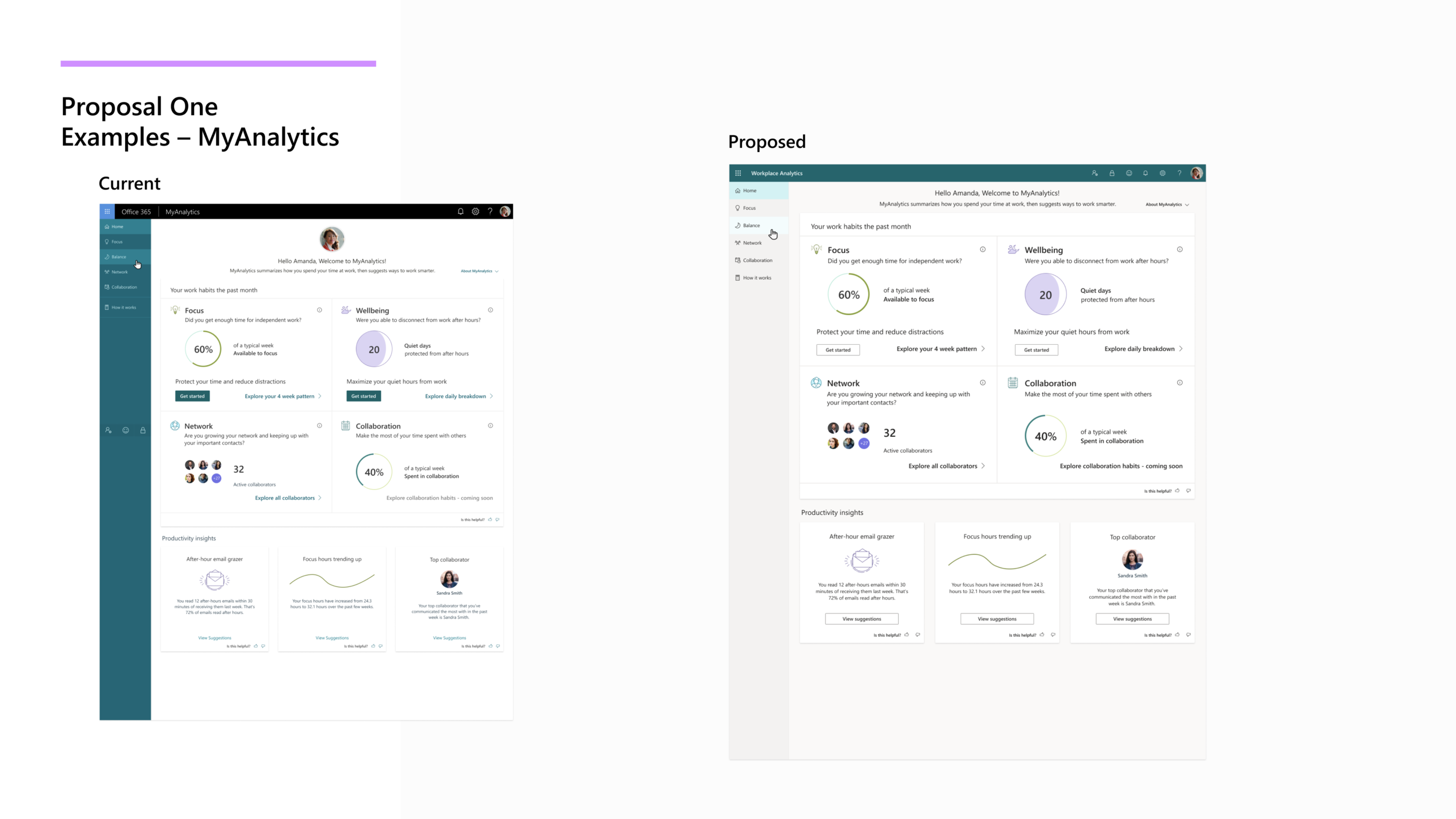
Example from an exploration on dashboards done after the new system was laid out that I created as separate IC work.
Implementation in designs going forward
As the new set of FTE’s started adding to the product, the new system has been implemented across every facet. Now both MyAnalytics and Workplace Analytics will have a look and feel that match each other and match the rest of the Office Suite.
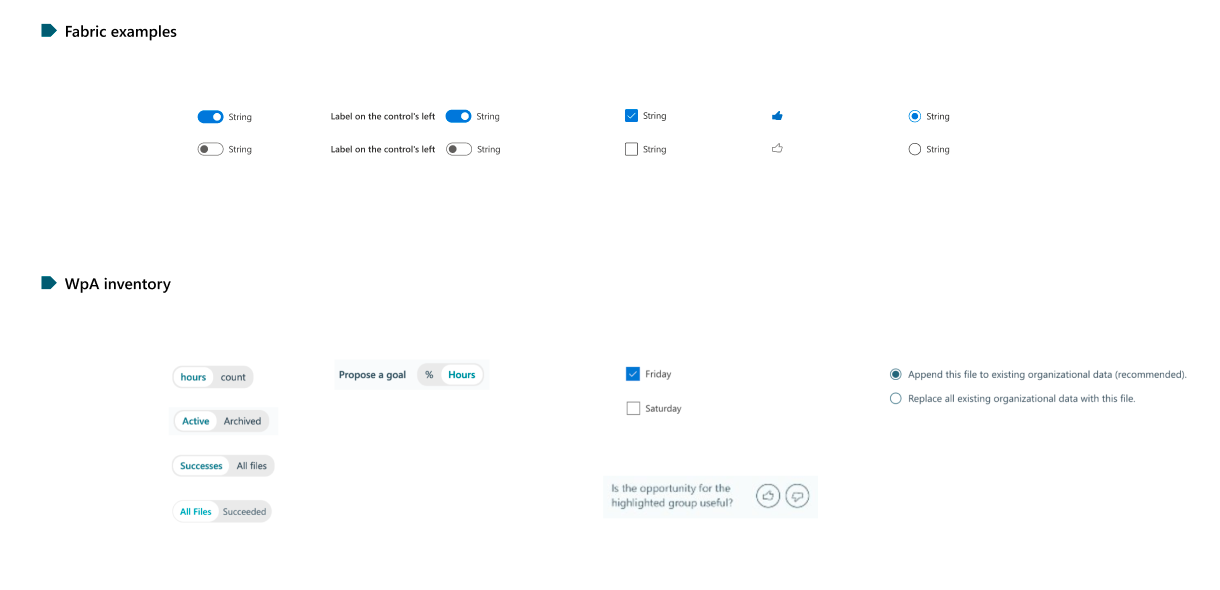
Example of the new system, being used by another designer focusing on MyAnalytics, being implemented
Success of process
This is one of my examples where the success of the steps is hard to quantify. I would like to believe the overall improvement in aesthetics and minimalistic style influenced the increase of usage that has occurred in the product. Within the design and PM teams the success was easy to see. New designs moving forward have a clearer set of instructions on what the product should look and feel like, and more time is spent on interactions and new flows rather than just fixing visual bugs.