Michael Senkow
I Build Machines
Two Projects: Professor Salaries and the Olympics vs Health
An early set of some grad school data-viz focused projects. I’ve had interest in this specific realm most of my career and it I’ve always found understanding the code behind everything makes this work go better.
Processing App, created with public university salary data (solo project)

D3.Js project comparing various public numbers about countries to their olympic winnings (group project, honestly a reason to explore the potentials of parallel coordinate charts)
Experimental exploration using Processing and public university salary data
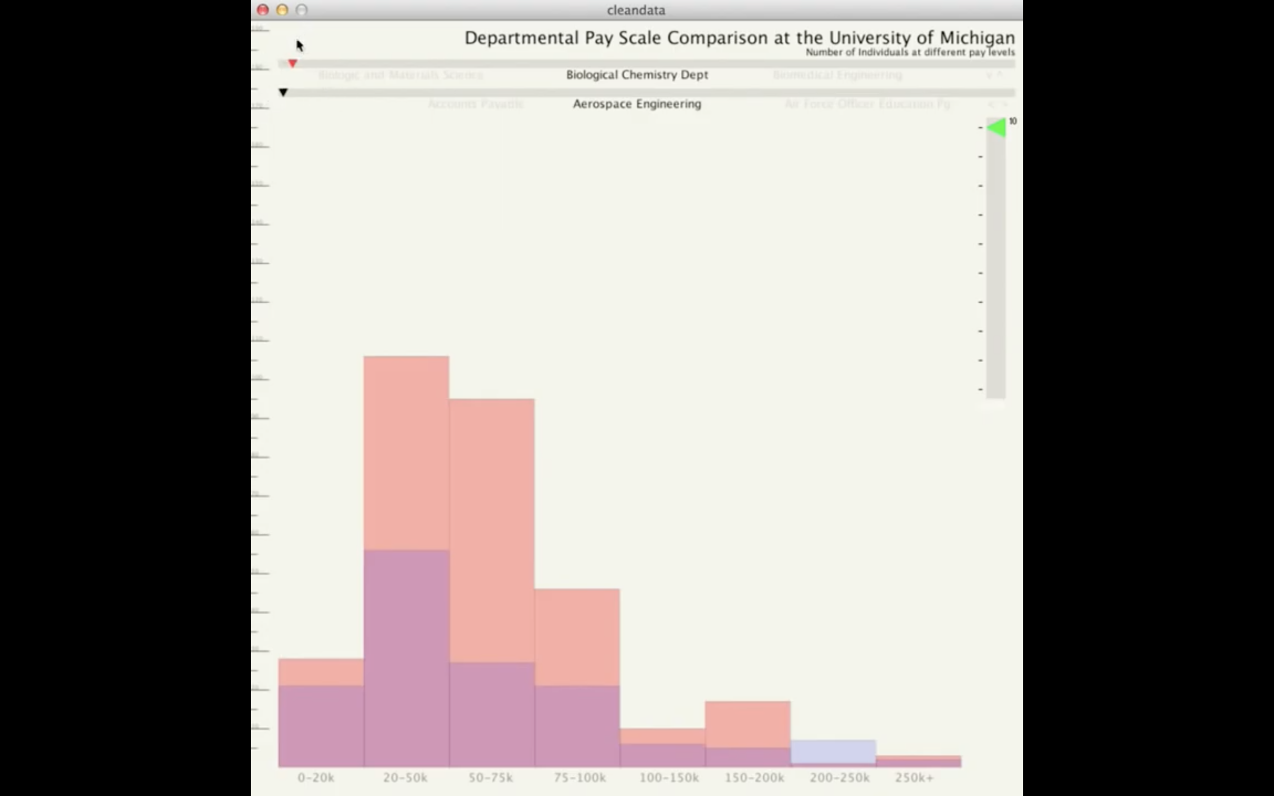
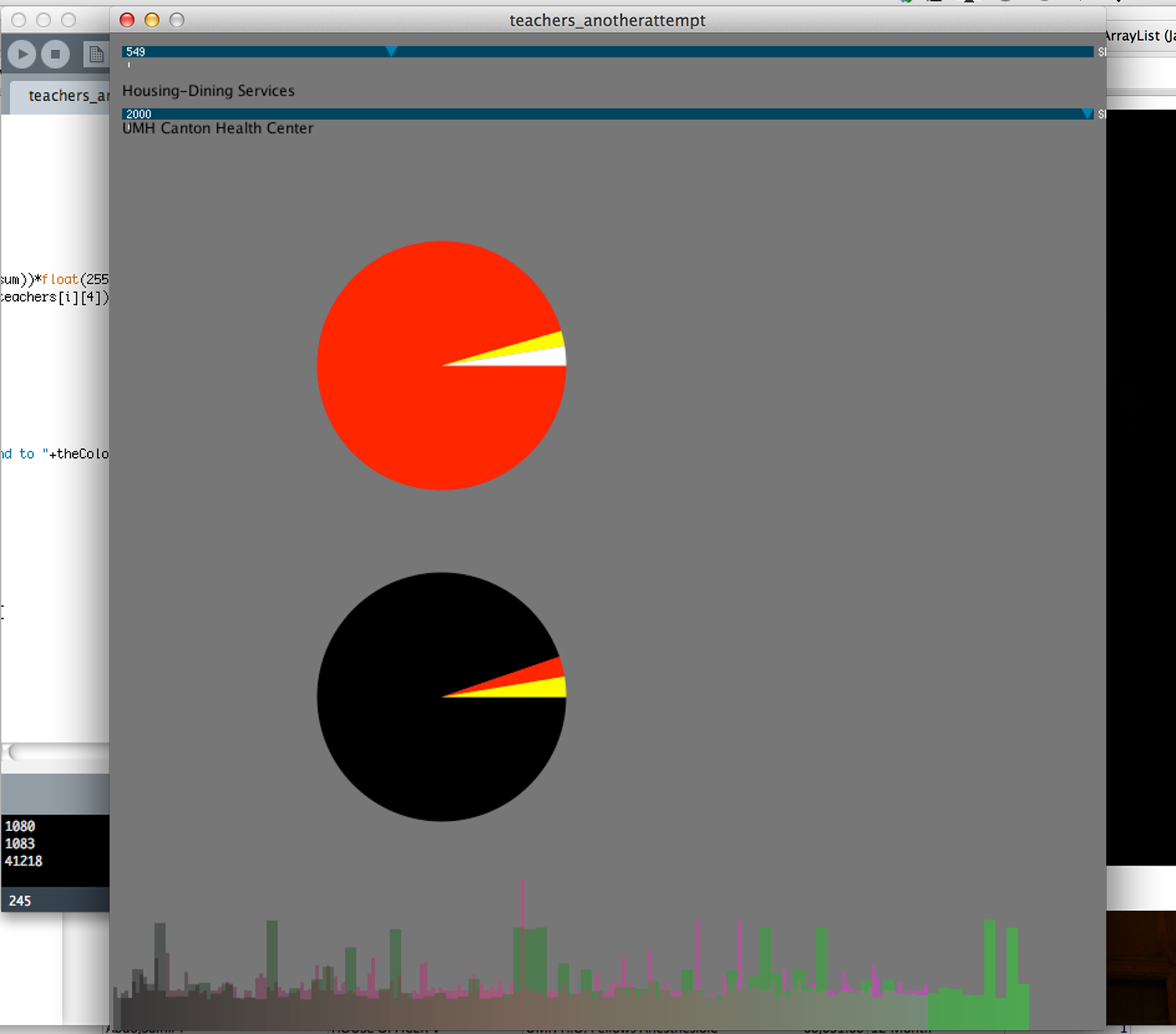
For the first project, I took the data provided through UM of all their pay scales throughout the university and using processing created a unique visual of the data. The final piece for that was made in processing though and doesn't transpose to the web well, so I have a video of the end piece. (*** Looking back on this, this was haaaard. I mean seriously, now I’d just jump to any number of public libraries that do this easily. But I set up every step of this little app, the axises, the comparison of opacity so you could see the two charts on top of each other….I really need to do more work like this on the side.*** - Michael 2020)


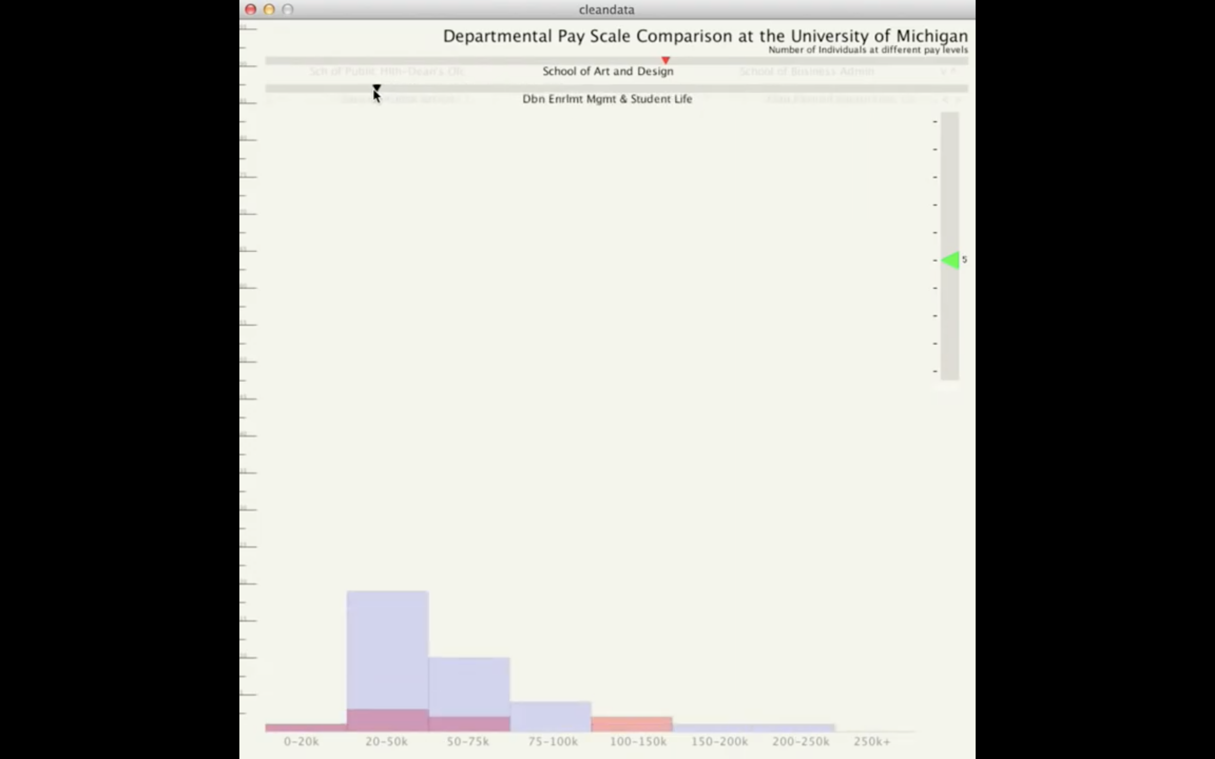
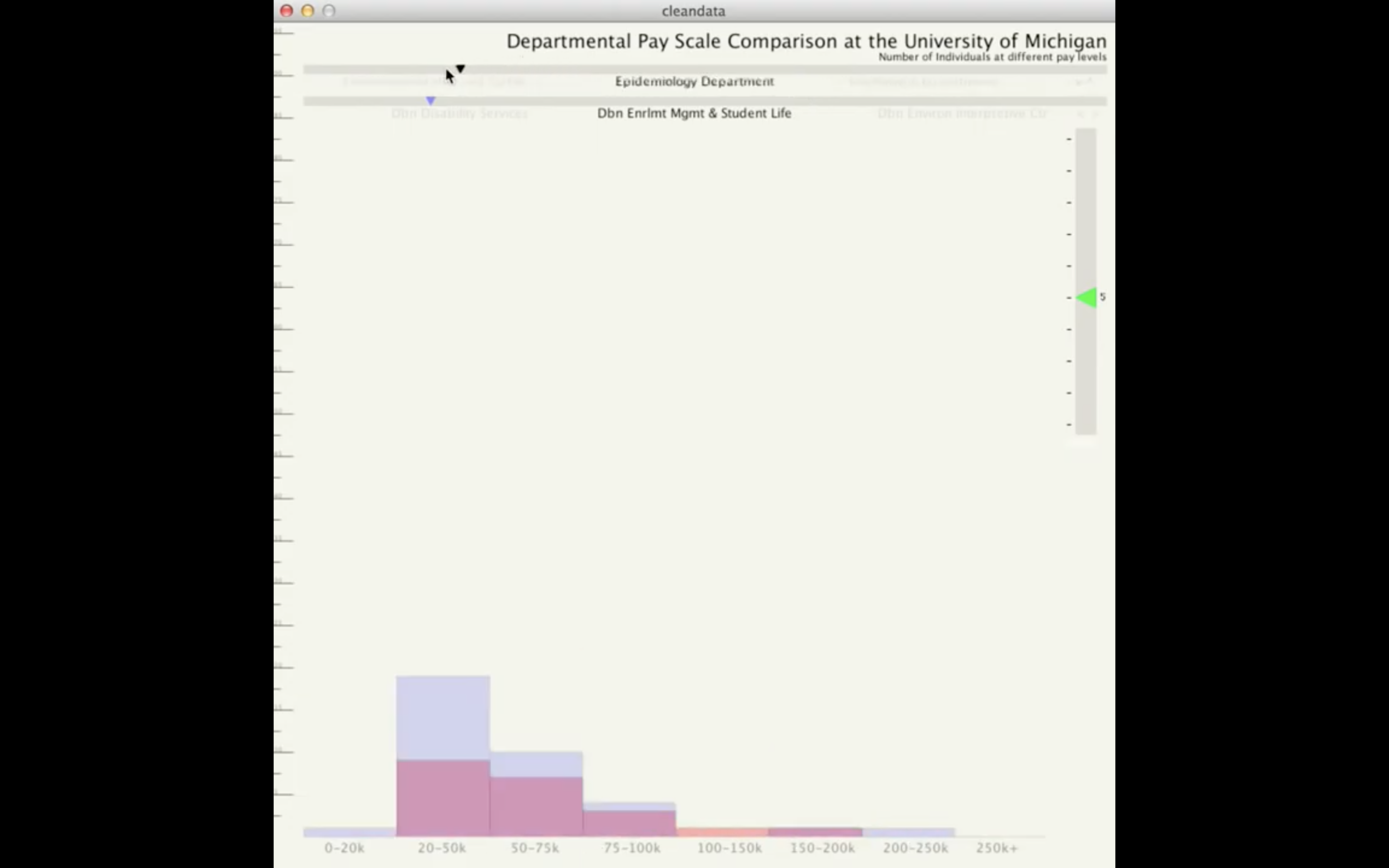


Various experiments were made, and the final piece allows a user to look through pay scales of different departments and quickly compare them, changing scale when departments have too many people or too few to work with the current view. I enjoy looking back on this project just in that it started my interest in really trying to finesse the details of a project. A video of the final project can be viewed here.
Olympic Winning data compared to country health statistics
The second project dealt with looking at Olympic data and comparing it to various country statistics (population, GDP, hdi, etc.) As a group we went through extensive testing, sketching, and data cleaning to end up with the final project. Specific design features came about from comparative analysis, to other visualizations of similar data, and other variations on multiple sets data at once. For example:
- Choices in line-weight and type change based on hover, selection, and filtering.
- Color selection to both ease comparison but also not be the primary selection mechanism.
- Simple concepts like the selection of what data was shown versus what data was hidden away.


